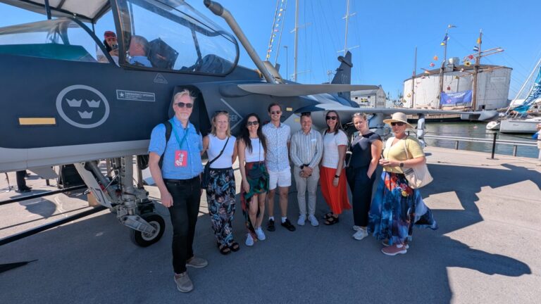
The IoT Hub has been up and running for a couple of months now. One thing we been working a lot with is our name and visual identity. For us, it’s important to be inclusive and find a way to express our ambitions in a straightforward and clear way. Therefore have we decided that we are now IoT World.

In addition to ”IoT World” we also use the ”ad-on” ”In an …” in some contexts. Together that becomes ”In an IoT World.” It creates the opportunity for a story about what happens in the Internet of Things area. The large number of players involved in the initiative constantly creates new solutions and develops ideas. By having a clear storytelling approach, we can tell about all the different actors’ activities under the same ”umbrella.” In an IoT World… talks about the future, technical and social development by retelling what happens to the different actors. In this way, the umbrella can interact with many, while it is still keen on its on under the IoT World brand.
The logo is painted with strong color-intensive brush strokes. It has a creative force, and signals change, development and creativity. The expression stands for the human who contrasts the content, the technology (IoT). Technology for the planet and for a better future for us
To the logo, additional text can be added in a written font. This means that a large number of players involved in IoT World can use the graphics in their contexts in a flexible way. The texts can be varied to distinguish places, regions, events, groups, etc. The font selection signals information and concretion.
Behind the logo, a picture plate can be used to further strengthen the global allocation in the world.